
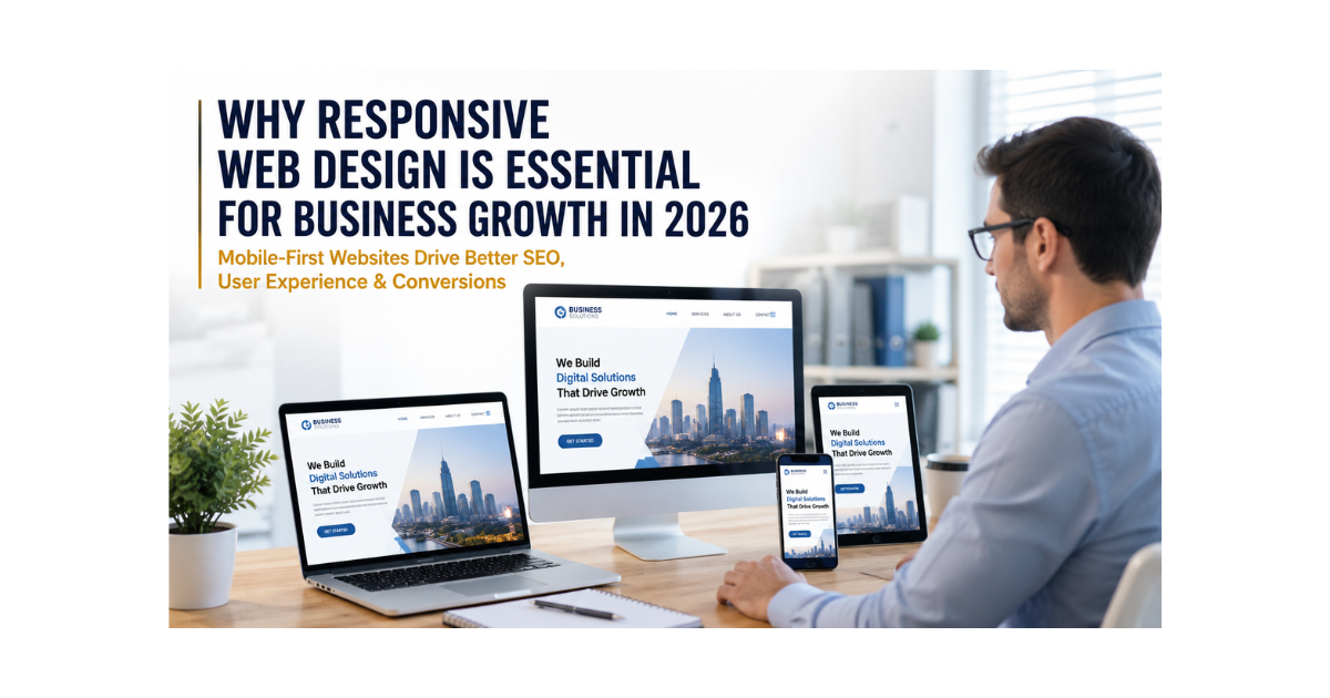
Think about the last time a website looked completely broken on your phone, tiny text, buttons you could not tap, images falling off the screen. Did you stay on that site?
Probably not.
Now imagine that is your business website. And the person who just left was a potential customer in Chicago, London, or Toronto ready to buy.
In 2026, more than three quarters of all internet traffic will come from mobile devices. If your website does not work perfectly on a phone, you are not just losing visitors, you are actively pushing customers toward your competitors.
Responsive web design is the solution. And for any business serious about growth, it is not optional anymore. It is the foundation everything else is built on.
In this guide, MarkMates breaks down exactly why responsive design matters, how it directly impacts your search rankings and revenue, and what you can do about it today.
What Is Responsive Web Design?
Responsive web design (RWD) is a web development approach that makes your website automatically adjust its layout, images, and content to fit any screen size from a 27-inch desktop monitor to a 5-inch smartphone screen.
| DefinitionResponsive web design is a design methodology where a website’s layout fluidly adapts to the screen size, orientation, and resolution of any device providing an optimal viewing and interaction experience without the need for separate mobile or desktop versions. |
Before responsive design became the standard, many businesses built two separate websites: one for desktop and one for mobile. That approach is costly, time-consuming to maintain, and increasingly ineffective.
A truly responsive website uses flexible grid layouts, scalable images, and CSS media queries to deliver one seamless experience on every device. The result is a website that looks and works perfectly whether your customer is on a laptop at work or scrolling their phone on the subway.
Mobile Usage in 2026: The Numbers That Matter
The shift to mobile-first browsing is not a trend, it is the new reality of the internet. Here is what the data shows:
| 75%+of global web traffic from mobile devices | 73%of users leave non-mobile-friendly websites | 53%abandon pages that take over 3 seconds to load |
Beyond raw traffic numbers, mobile users behave differently. They expect instant loading, intuitive navigation, and content that fits their screen without pinching or zooming. When a website fails to meet these expectations, users leave and they rarely come back.
For businesses in competitive markets like the USA, UK, Canada, and Germany, a poor mobile experience is not just an inconvenience. It is a direct revenue leak.
Google Prioritizes Responsive Websites: Here Is What That Means for You
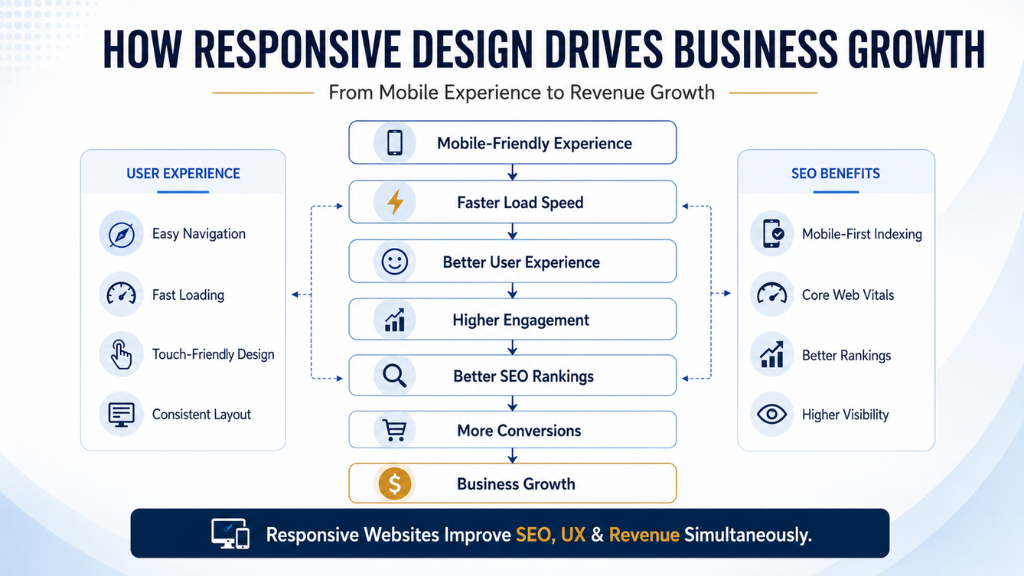
Mobile-First Indexing
Google switched to mobile-first indexing as its default ranking method. This means Google primarily uses the mobile version of your website to determine how it ranks in search results even for desktop searches.
If your mobile site is slow, incomplete, or poorly structured, Google will rank it lower regardless of how good your desktop version looks.
Core Web Vitals
Google’s Core Web Vitals are a set of real-world performance metrics that directly influence search rankings. They measure three things:
• Largest Contentful Paint (LCP) How fast the main content loads (target: under 2.5 seconds)
• Cumulative Layout Shift (CLS) How stable the page is as it loads, no elements jumping around
• Interaction to Next Paint (INP) How quickly the page responds to user interactions
Responsive, well-optimized websites score better on all three metrics and websites that score well rank higher. It is a direct line from responsive design to better SEO visibility.
Search Ranking Benefits
When your website is responsive and passes Core Web Vitals, the benefits compound:
• Higher positions in mobile and desktop search results
• Increased organic click-through rates (better visibility means more clicks)
• Improved crawl efficiency one URL for all devices means Google indexes your content once, correctly
• Stronger local SEO performance critical for businesses targeting customers in specific cities or regions
How Responsive Design Improves User Experience
Easier Navigation on Every Device
Responsive websites use touch-friendly menus, appropriately sized buttons, and layouts that make sense on small screens. Users can find what they are looking for quickly without frustration. When navigation is easy, people stay longer and explore more.
Faster Loading Speeds
A responsively designed website is typically optimized for performance. Compressed images, minimal unnecessary code, and efficient CSS all contribute to faster load times. Google data shows that 53% of mobile users abandon a site that takes more than 3 seconds to load. Every second matters.
Higher Conversion Rates
When your website loads fast, is easy to navigate, and has clear calls-to-action that work on any screen, more visitors take action. Whether that means filling out a contact form, making a purchase, or booking a consultation a responsive website converts better.
Research from Google found that mobile-friendly landing pages convert up to 160% better than non-optimized equivalents. That is not a marginal improvement , it is a business transformation.
Business Benefits of Responsive Web Design
Here is a clear breakdown of how responsive design directly impacts your business:
| Benefit | Business Impact |
| Higher Conversion Rates | Mobile-optimized CTAs and checkout flows turn more visitors into customers |
| Better Brand Credibility | 75% of users judge company credibility by website design responsive sites build trust instantly |
| Lower Bounce Rates | Visitors stay when the experience is smooth reducing bounce rates by 20–30% on average |
| Cost-Effective Maintenance | One responsive website is cheaper to update than separate mobile and desktop versions |
| Improved Social Media Traffic | Most social media clicks come from mobile a responsive site captures that traffic effectively |
| Omnichannel Support | A consistent experience across all devices supports unified marketing campaigns |
Responsive Design and Future-Proof Business Growth
The devices people use to access the internet are constantly evolving. A responsive website is built to handle what is coming, not just what exists today.
Emerging Device Compatibility
In 2026 and beyond, websites must work across a rapidly expanding range of form factors:
• Foldable smartphones screens that change dimensions when opened or closed
• Wearable devices smartwatches and AR glasses with micro-screens
• Smart TVs and connected displays large screens used for browsing
• Voice search interfaces where responsive structure supports voice-based navigation
Responsive frameworks like CSS Grid and Flexbox are built with flexibility at their core making adaptation to new devices far easier than rebuilding from scratch.
Progressive Web Apps (PWA)
Progressive Web Apps combine the best of websites and mobile apps. They are fast, work offline, and can be installed on a device’s home screen. Building a responsive website is the essential first step toward PWA capability, which is becoming a competitive standard in e-commerce and SaaS.
AI-Driven Personalization
AI tools are increasingly used to personalize website experiences showing different content to different users based on behavior, location, and device. Responsive architecture is a prerequisite for this kind of intelligent personalization to function correctly.
Technical Features of a Responsive Website
Understanding the technical underpinnings helps you evaluate whether your current website is truly responsive or just partially optimized:
• Flexible Grid Layouts CSS Grid and Flexbox allow content to reflow naturally based on screen width rather than fixed pixel positions
• Responsive Images Images are served at the correct resolution for each device, preventing slow loads on mobile and pixelation on high-resolution displays
• Fluid Typography Font sizes scale proportionally with screen size so text remains readable on any device
• Media Queries CSS rules that apply different styles at different screen breakpoints (mobile, tablet, desktop, wide)
• Cross-Device Testing Validated performance across real devices and browsers, not just emulators
• Performance Optimization Minified CSS/JS, lazy-loaded images, and efficient caching strategies that keep load times under 2.5 seconds
Why Businesses Lose Customers Without Responsive Design
The cost of a non-responsive website is easy to underestimate until you do the math.
• Slow load times A 1-second delay in mobile load time reduces conversions by up to 20% (Google data)
• Poor mobile UX Tiny buttons, horizontal scrolling, and overlapping elements drive visitors away immediately
• High bounce rates If users leave without engaging, Google interprets this as a low-quality page and drops your ranking
• Low trust and credibility A website that looks broken on mobile signals unprofessionalism costing sales before a single conversation happens
• Competitor advantage If your competitor’s site works perfectly on mobile and yours does not, the choice for the customer is easy
Every day your website is not fully responsive, you are leaving real money on the table. The good news is that it is entirely fixable.
Why Choose Mark Mates for Responsive Website Design
MarkMates is a full-service digital growth agency building modern, responsive websites for businesses across the USA, UK, Canada, and Germany. Every website we build is engineered from the ground up for mobile-first performance, SEO, and conversion.
Here is what sets Mark Mates apart:
• Modern UI/UX Design Clean, conversion-focused layouts that look great on every device
• SEO-Optimized Development Built with Core Web Vitals, mobile-first indexing, and structured data in mind from day one
• Business-Focused Strategy We do not just build websites. We build websites that generate leads and revenue
• Conversion-Driven Design Every CTA, form, and user flow is designed to turn visitors into customers
• Long-Term Growth Solutions Ongoing performance monitoring, speed optimization, and content updates
Frequently Asked Questions
Why does every business need a professional website?
A professional website builds trust, generates leads, and gives businesses a 24/7 digital storefront. Research shows that 75% of users judge a company’s credibility based on website design alone making a professional, well-designed website one of the highest-ROI investments a business can make.
Why is it important to have a responsive website?
A responsive website ensures that visitors get a great experience whether they are on a phone, tablet, or desktop. Since over 75% of web traffic now comes from mobile devices, a non-responsive website actively loses visitors and customers. Approximately 73% of users abandon websites that are not mobile-friendly, making responsiveness a direct revenue factor.
What are the 7 C’s of a website?
The 7 C’s of a website are: Context (look and feel), Content (text, images, video), Community (user interaction), Customization (personalization), Communication (ways to engage), Connection (links to other sites and platforms), and Commerce (buying and selling functionality). Together, these elements define a website that is both useful and conversion-ready.
Why is responsiveness important in business?
In digital business, responsiveness means your website works perfectly for every visitor on every device, at every time. This directly improves customer satisfaction, trust, and retention. A responsive website reduces friction in the buying journey, which leads to more enquiries, more purchases, and stronger long-term relationships.
Does responsive design affect SEO rankings?
Yes, significantly. Google uses mobile-first indexing, meaning it ranks websites based on their mobile version. A responsive website that passes Core Web Vitals (fast load, stable layout, responsive interaction) ranks higher in search results. Poor mobile performance directly reduces search visibility and organic traffic.
How long does it take to build a responsive website?
A professionally designed responsive website typically takes 3–8 weeks depending on complexity, number of pages, and custom functionality required. Simple brochure sites can be completed in 2–3 weeks. E-commerce platforms or sites with custom integrations take 6–12 weeks. MarkMates provides clear timelines and milestones at the start of every project.
How does MarkMates build responsive websites?
MarkMates follows a strategy-first web design process: audience research and competitor analysis, wireframing and UX design, responsive development using modern CSS frameworks, SEO technical setup, and performance optimization before launch. Every website is tested across real devices and browsers before going live. To get started, visit markmates.co.
Conclusion: Your Website Is Your Best Sales Tool: Make It Work on Every Device
In 2026, a website that is not responsive is not just outdated, it is actively costing your business money. Every unreadable page, every broken layout on a mobile screen, every slow-loading image is a customer lost to a competitor who invested in their digital presence.
Responsive web design is not a luxury upgrade. It is the baseline standard for any business that wants to be found on Google, trusted by customers, and competitive in its market.
The good news: getting there is straightforward, especially with the right partner.
| Ready to Build a Website That Works Everywhere?MarkMates designs and develops responsive, SEO-optimized websites that look great on every device and are built to convert visitors into customers. Whether you are launching a new site or redesigning an existing one, our team is ready to help. Get started at markmates.co. |